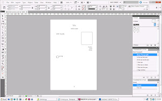
Why, it's a copy of Adobe InDesign, one of several ferociously expensive lumps of software designed to turn words into books. Using the basic features lets you make page layouts fairly easily, but there are gigantorific numbers of tiny tweaky features hanging about beneath the surface if you want to get stuck in to things like ligature choices and interactive PDF design. Frankly though, I don't.
I'm not going to go into the nitty gritty of layout, because there's already masses of that all over the internet. Basically, I needed two kinds of pages: the standard ones filled with bits of story, and the front page for each author, with their photo and biography. The standard pages came first, and ended up looking like this:
Or, without guides:
The font is Palatino Linotype, which is a fairly typical choice for a book. It's clear, moderately pretty, sensibly spaced and I have a good collection of character sets for it, meaning I don't have to worry about not having proper italics or bold lettering.
Publishing being a high-tech industry, I came up with size, borders and spacing by pulling books off my shelf, deciding which ones looked pretty, then measuring bits of them with a ruler. I wouldn't care to speak for the industry as a whole, but I suspect I'm not the only one who does this.
Once those were put together I moved on to the front page. This needed a heading, a photo box, a biography section and a smaller box for contact details. It came out like this.
Or, without guides:
One thing these images reveal is that an empty template doesn't do much to demonstrate how things will really look. So, to test things out, I borrowed the opening of Thomas Malory's Le Morte d'Arthur and slammed it into the template. Here, as the philosopher said, is one I made earlier:
Incidentally, apologies for the mugshot. Malory was notoriously unphotogenic, so he's had to settle for an artist's impression. This artist's impression was put together in Adobe Illustrator, which came with my copy of InDesign as part of the Adobe Creative Suite Design Standard Edition. If you are observant you may notice that I'm not very good at Illustrator. Technically it's a fairly snazzy bit of art software, but as far as I'm concerned it's Microsoft Paint with more buttons (*hopes no future job interviewers read this paragraph*).
This design will probably be tweaked over the coming weeks. In particular, I'm not happy with the contact details box or the position of the picture borders. However, that is far from urgent, and for now this design should suffice. The important thing is that this gives a reasonable estimate of words to a page, and this means I can come up with an approximate word count for the writers. See next week, when scheduling starts happening.


No comments:
Post a Comment